Gold Bond
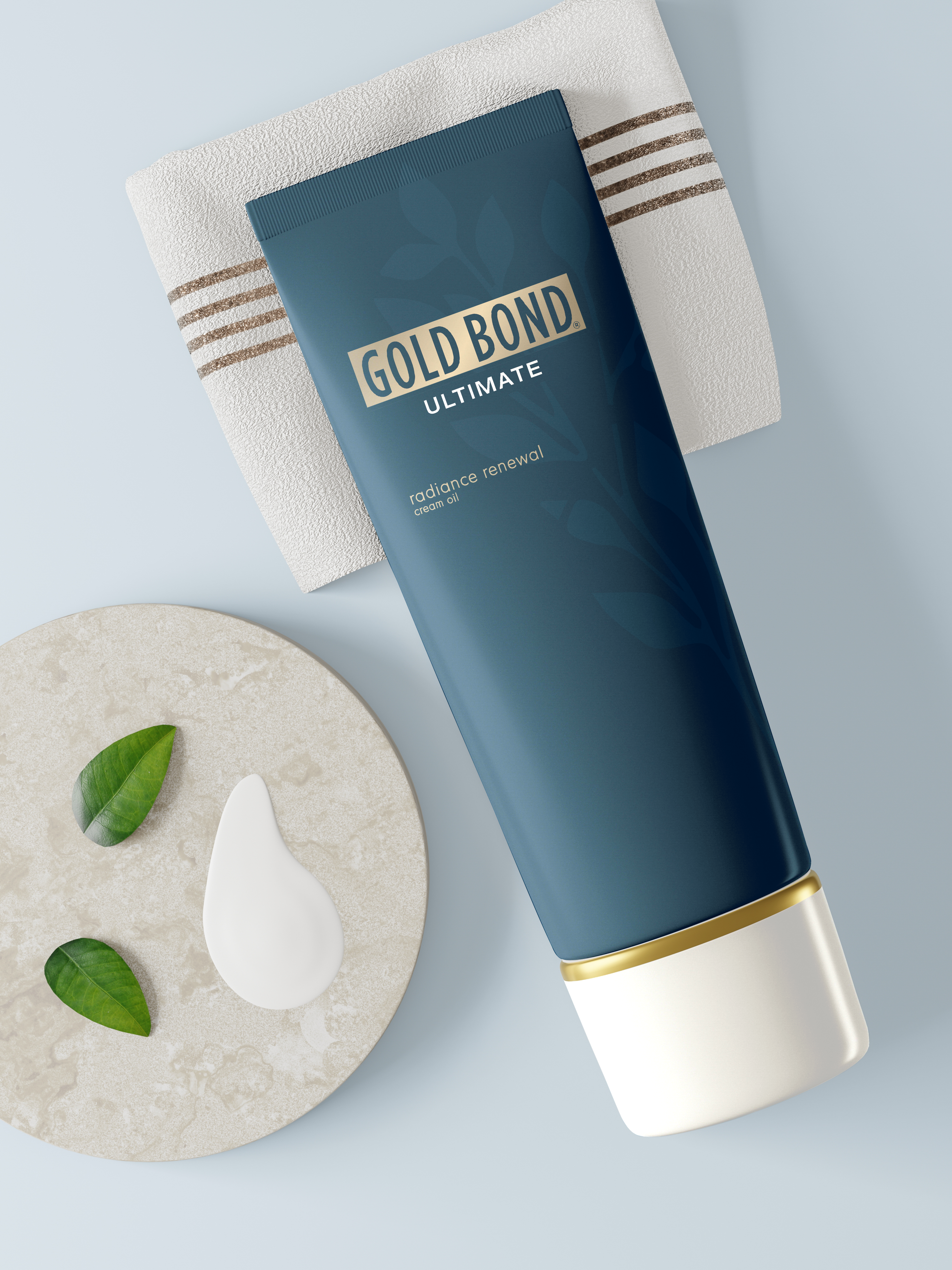
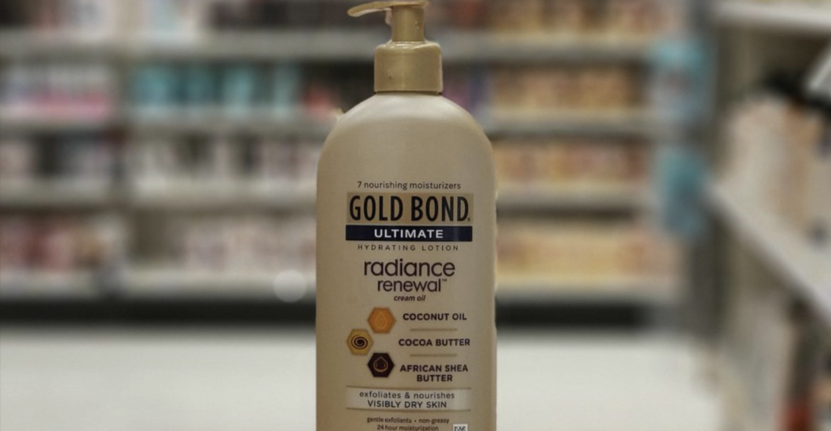
Gold Bond markets itself as a luxurious brand that soothes and repairs troubled skin while competing in the cost-effective market. While examining the original bottle design it was clear that it lacked hierarchy. The treatment of type did not follow the basic principles of typography. The original information was printed on a sticker, a cheap way to adhere information to the bottle. Switching from a sticker to a box allowed more real estate to spread out the information. It is also much more cost effective to print on a box rather than a bottle. This approach allowed for a simple, yet elegant bottle design to go inside the box. This design is unique from Gold Bond's competitors and will stand out on the shelf.
SERVICES
Packaging
Typography
BRAND ADJECTIVES
Soothing
Calming
Luxurious
SOFTWARE
Adobe Illustrator
Adobe Photoshop
DELIVERABLES
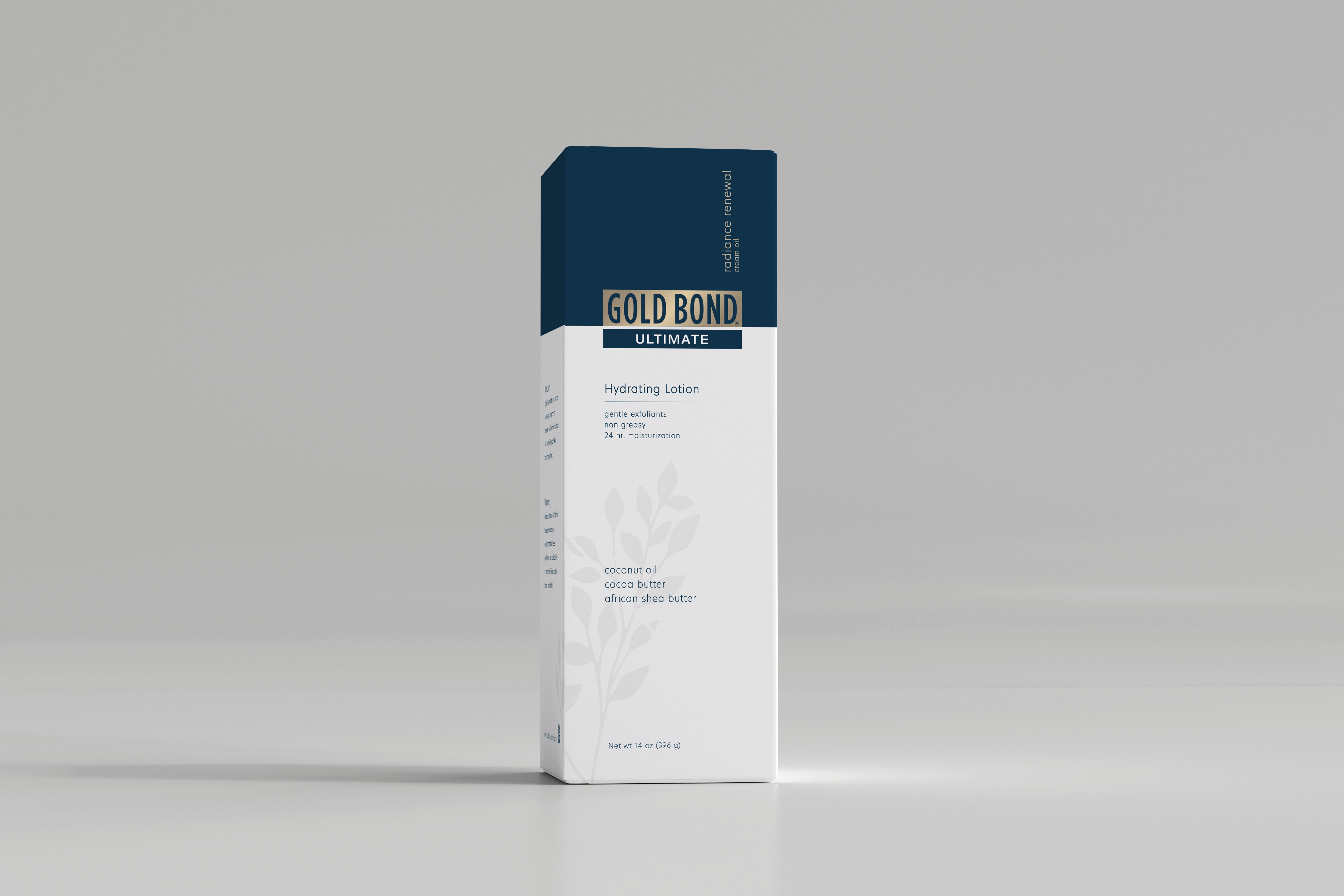
BOX DESIGN | BOTTLE DESIGN
Let's Chat!
KIND WORDS FROM THE CLIENT:
"Lorem ipsum dolor sit amet, consectetur adipiscing elit, sed do eiusmod tempor incididunt ut labore et dolore magna aliqua. Ut enim ad minim veniam, quis nostrud exercitation ullamco laboris nisi ut aliquip ex ea commodo consequat. Duis aute irure dolor in reprehenderit in voluptate velit esse cillum dolore eu fugiat nulla pariatur. Excepteur sint occaecat cupidatat non proident, sunt in culpa qui officia deserunt mollit anim id est laborum."